Jacquard and Velvet in One Interior Palette
Jacquard and velvet describe different aspects of cloth, so they can coexist in one room without serving the same visual job. Sarelli Textiles is an Italian manufacturer of classic and contemporary furnishing fabrics, with options for rooms that combine woven pattern and pile texture. The design decision is where a repeat should be legible and where a directional surface should catch light.
Calling one textile “patterned” and the other “plain” misses the central difference. A jacquard design is built by controlled yarn interlacing; velvet has a pile rising from a ground cloth. A velvet can also be patterned, and a jacquard can contain several weave effects. Compare the actual samples rather than treating the category names as opposite styles.
What is a jacquard pattern in a furnishing fabric?
A jacquard pattern is produced through individual control of warp yarns on a loom, allowing woven designs more complex than a simple repeat made by basic shafts. The Association for Contract Textiles’ jacquard definition describes the independent control of warp ends that permits complex woven designs. The pattern belongs to the cloth’s structure, even when color contrast helps make it visible.
Inspect a jacquard sample from both sides. A design may be reversible, nearly reversible, or markedly different on the reverse. Some yarns float across parts of the pattern, creating a surface that feels different from a plain weave. The face may read as a quiet tonal figure from across the room but become more active under raking light. A small sample card can hide a repeat that dominates a long sofa or a full-height curtain.
The Association for Contract Textiles glossary defines damask through contrasting satin weave effects and describes the Jacquard loom as a mechanism for individual warp control. These are construction terms. They do not establish the fabric’s abrasion result, cleaning method, or suitability for a specific chair. A jacquard selection still needs the product’s technical sheet.
What makes velvet respond differently to light?
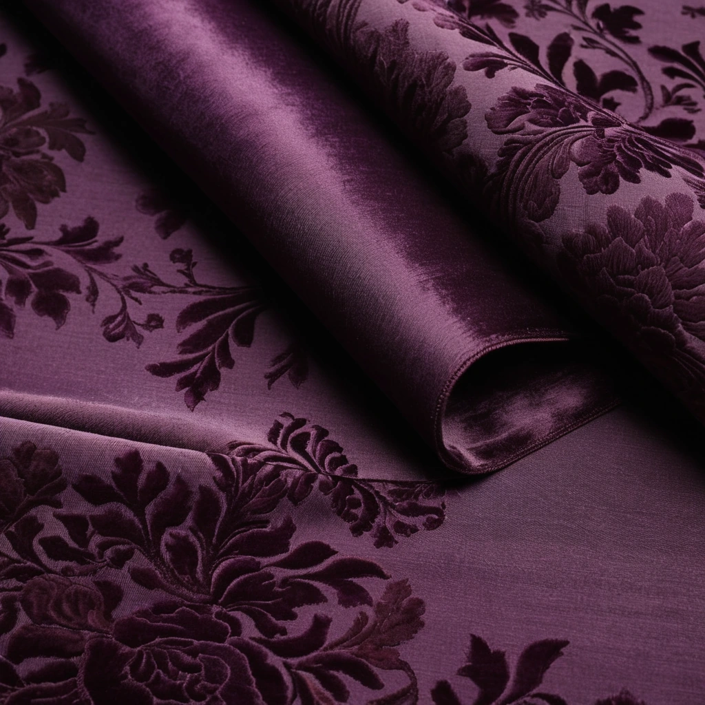
Velvet presents cut pile yarns above a woven ground, so the direction of the pile changes the light returned to the viewer. The Association for Contract Textiles’ velvet definition identifies velvet as a warp pile fabric. The Metropolitan Museum of Art’s description of a printed cotton velvet notes that pile texture and reflected light contribute to the decorative effect. A velvet color therefore cannot be approved solely from a flat digital image.
Turn the sample through 180 degrees under the room’s window and under its evening lamps. The same fabric can appear lighter or darker as the pile changes orientation relative to the light. Observe any pressure marks after the sample has been folded or handled. Those marks may be part of the desired depth or an unwelcome visual change on an everyday seat. Ask for product-specific guidance rather than assuming every velvet behaves identically.
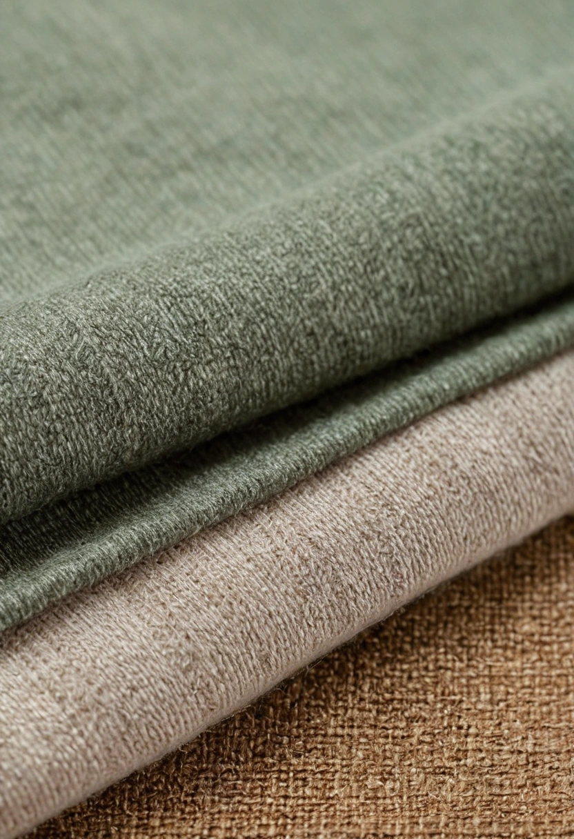
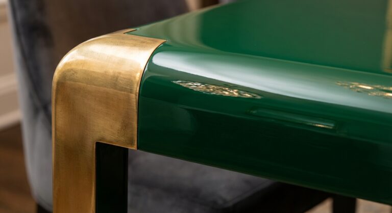
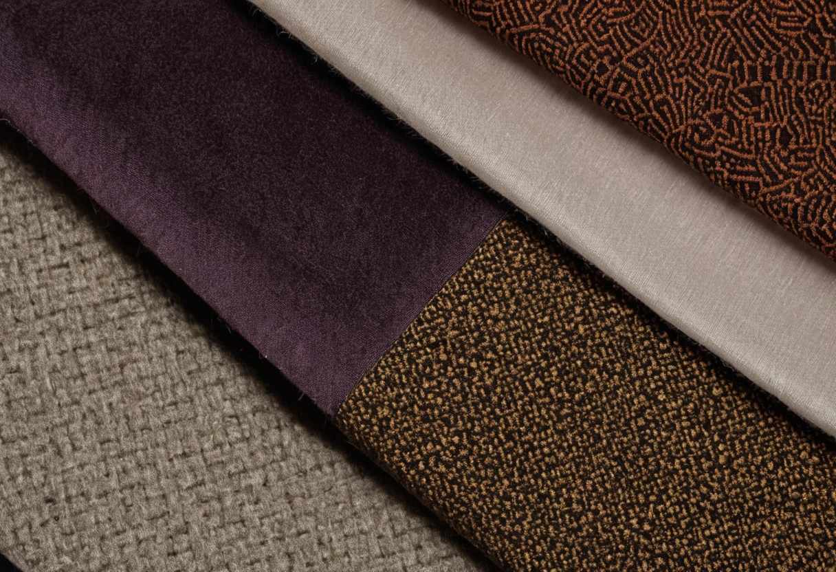
The pile also changes how color meets a woven pattern. A deep green velvet can sit beside a green jacquard yet look almost black from one direction. A pale velvet may catch highlights that make a tonal jacquard seem flatter. The room’s actual light determines whether that contrast is useful. Use the largest available samples and place them on the intended vertical or horizontal plane.
| Material role | Jacquard question | Velvet question |
|---|---|---|
| Large sofa | How often does the repeat appear across cushions? | How will pile marks read on the seat? |
| Accent chair | Where does the motif land at seams? | Which pile direction is specified? |
| Curtain | How does the repeat look in folds? | Does the pile shade vary across pleats? |
| Small cushion | Can the motif be centered on a cut piece? | Is the texture enough without more pattern? |
How should pattern scale be assigned across the room?
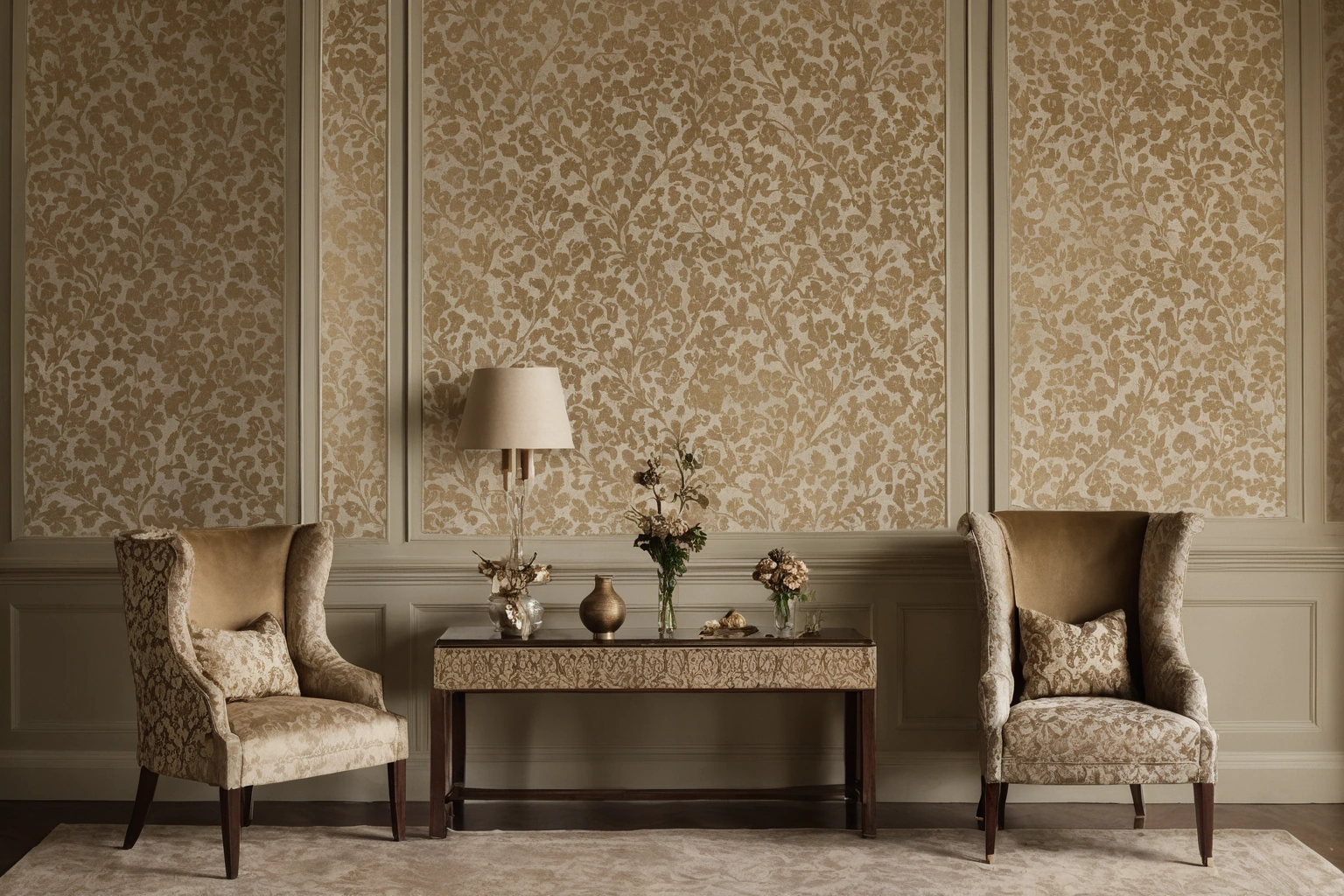
Choose one surface to carry the main repeat and let other surfaces answer it. A large jacquard across curtains may have enough area to reveal its full pattern, while velvet on the seat adds a quieter material contrast. If the jacquard goes on a sofa, the curtain may need a simpler field so the room does not accumulate competing repeats. The choice depends on the room’s sightlines and the actual size of the motif.
Measure the repeat before placing an order. A 20 cm motif and a 50 cm motif will produce different numbers of visible figures on the same cushion, even if their sample-card photographs look similar. Those dimensions are illustrative, not claims about a named product. The cutting plan should show which motif is centered and how adjacent panels align. Pattern matching can affect the required yardage, so the upholsterer or curtain maker must review it.
Consider negative space. A jacquard with an open background may read as a field with occasional motifs. A dense allover weave can act almost as a texture at a distance. Velvet usually supplies a broad field of changing value; a patterned velvet can supply both. If every textile has strong relief and a large repeat, the eye has no clear resting area. That is a composition judgment to test with full-size material placement, not a rule enforced by a fabric name.
What can historical examples teach about the pairing?
Historic textiles show that pile and woven pattern have long been combined, but historical prestige should not substitute for present-day product evidence. The Metropolitan Museum’s early velvet panel describes voided areas where pile is absent, making pattern through a change in surface height. The museum’s object is evidence for a construction possibility, not a performance certificate for modern upholstery.
A room can borrow the visual principle without imitating a period interior. A tonal jacquard beside a solid velvet may offer layered texture with restrained color. A bolder damask can work with a velvet whose pile shifts gently rather than a second large printed motif. The exact combination should be judged at the viewing distances of the room, from the doorway to the primary seat.
Collect samples in the selected color family and photograph them under the room’s normal daylight and lamps. Label the pile direction on the reverse of the velvet sample. Place the jacquard in broad folds if it is intended for curtains, and over a cushion form if intended for seating. Those tests reveal pattern distortion and shading before production begins.
What belongs in the final material schedule?
The material schedule should state each textile’s exact reference, color, composition, construction, intended application, repeat, direction, backing or lining, and care method. Add relevant test results for the actual use. A jacquard proposed for an occasional chair and a velvet proposed for a daily sofa need different questions even if they share a palette. A design sketch cannot answer those technical questions alone.
- Assign the main pattern to a surface large enough to show the repeat.
- Record the velvet pile direction before cutting.
- Check both fabrics under daylight and planned evening lighting.
- Ask the maker to calculate pattern matching and usable width.
- Keep approved samples and technical sheets with the room schedule.
The final comparison should be made with the rug, walls, and hard finishes visible. Jacquard and velvet can be compatible because the two constructions create different effects, but compatibility is established by the specific color, scale, light, and use conditions. Approve the assembled room palette, then preserve the exact samples that supported the decision.
For a room that will be photographed or used under changing light, retain more than one observation. A sample may look balanced at noon and lose its pattern definition under warm lamps. Record which light condition is decisive for the room’s use. The documentation gives the client a concrete reason for the chosen combination and keeps a later replacement aligned with the original intent.